
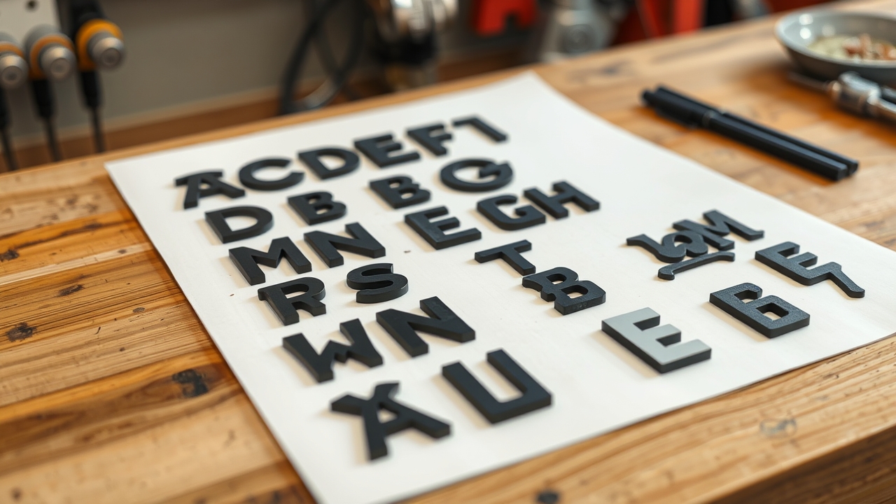
Custom vs stock fonts is a real decision for anyone ordering vinyl lettering, not just a branding question. Font choice affects readability at speed, cutting precision on small sizes, and whether your truck lettering looks like a thousand other vehicles or distinctly yours. We cut vinyl lettering in Indiana for contractors, fleets, and small businesses, and we see this question come up weekly.
Custom vs Stock Fonts: Stock Options and When They Work
Stock fonts are pre-built typefaces available in design software and vinyl cutting systems. At Hoosier Decal, our vinyl lettering builder includes over 80 stock fonts covering serif, sans-serif, script, condensed, and decorative styles. Stock fonts are the right choice for most commercial lettering applications.
Advantages of Stock Fonts
- No artwork fee: Stock fonts are ready to cut without file prep. You pick, we cut.
- Proven cuttability: Every font in our builder has been tested at common sizes. We know which ones cut cleanly at 2 inches and which are only suited for 4 inches and up.
- Consistent across orders: When you reorder in a year, the same font is available at the same specs. No file dependencies.
- Fast turnaround: No design review step. Your order goes to production the same day in most cases.
Common Stock Font Choices for Commercial Vehicles
For fleet and commercial vehicle lettering, the most reliable performers are clean sans-serif fonts with open letterforms. Think Interstate, Helvetica Condensed, Arial Bold, or Futura. These read well from 30 feet and cut cleanly at 2-inch heights, which matters for USDOT numbers. Script fonts can work for company name lettering if sized 4 inches or larger but are often a liability on USDOT and regulatory lettering where legibility is a compliance requirement.
Custom Fonts: When Your Brand Demands Something Different
Custom fonts fall into two categories: licensed commercial typefaces you’ve purchased for your brand, and genuinely proprietary letterforms created specifically for your company. Both can be used for vinyl lettering if you provide the correct file.
Licensed Commercial Typefaces
If your company already uses a specific font in your logo and marketing materials, chances are it’s a licensed typeface. You may have purchased it from a type foundry or it was included in a design software subscription. Fonts like Gotham, Brandon Grotesque, or Proxima Nova are examples of licensed commercial typefaces used in brand systems. To use these in vinyl lettering, you need to provide the font file or a vector-traced version of the text. Our production team can accept outlined text in AI, EPS, or PDF format.
Proprietary Letterforms
Some larger companies develop custom letterforms as part of a brand identity project. These are often found in logos and don’t exist as a standard font file; they were drawn by a designer. For these, you’ll need to provide a vector file with the text converted to outlines. Our team works with outlined vector art daily. Just note that intricate custom letterforms with very thin strokes or tight interior spaces may need to be sized up for clean vinyl cutting.
File Requirements for Custom Font Orders
When providing custom font lettering for vinyl cutting, submit the text as outlined vectors in AI, EPS, SVG, or PDF format. If you send a live-text PDF where the font isn’t embedded, our system may substitute a different typeface. When in doubt, outline your text before exporting. Upload your artwork here and our team will flag any issues before production starts.
Readability Factors That Affect Font Choice
A font that looks great in a brand kit doesn’t automatically read well on the side of a moving truck. Distance, speed, and substrate color all affect readability. Here’s what we factor in when reviewing orders.
Stroke Width
Thin-stroke fonts (ultra-light, thin, hairline weights) look elegant on screen but disappear at distance on a vehicle. At 3-inch letter height, a hairline stroke is less than 1/16 of an inch wide, which is at the edge of reliable vinyl cutting precision and nearly invisible from 50 feet. Regular, bold, and condensed weights cut cleanly and read from distance. If your brand font is thin-stroked, consider using a heavier weight for vehicle lettering specifically.
Counter Space
Counter space is the enclosed area inside letterforms, like the hole in the letter “O” or the two holes in “B.” Tight counters (small enclosed areas relative to letter height) are harder to weed cleanly and close up visually at distance. Fonts like Broadway, Old English, or heavily decorative display faces often have problematic counter space below 3-inch letter height. Clean sans-serif fonts with generous counters work at 2 inches and smaller.
Script and Cursive Fonts
Script fonts read as signatures and feel personal. They work well for company name lettering on trade vehicles when sized appropriately (4 inches or above for the tallest letter). They should never be used for compliance lettering like USDOT numbers, where legibility is a regulatory requirement. A script USDOT number at 2-inch height is asking for a roadside writeup.
Cuttability: Why Some Fonts Don’t Work in Vinyl
Not every font that looks great on screen translates well to vinyl. The cutting plotter follows vector paths with a blade, and certain design characteristics create problems in production.
- Minimum stroke width: We don’t recommend cutting strokes thinner than 1/16 inch. At small sizes, thin strokes tear during weeding.
- Tight interior spaces: Small enclosed areas in ornate fonts are difficult to weed cleanly without disturbing adjacent strokes.
- Connected scripts: Script fonts where letters connect require the entire word to be cut as one piece. If a stroke breaks, the whole word is compromised. We do it, but we size up on minimum height.
- Inline and outline effects: Fonts with built-in inline strokes (an outline inside the letterform) require double cutting passes and add production time.
When you use our lettering builder to size and preview your order, we’ve pre-screened the fonts in the system for cutting viability. If you’re bringing a custom font, our team reviews it before production and contacts you if sizing adjustment is recommended.
Custom vs Stock Fonts: Brand Consistency Across Your Fleet
One underappreciated benefit of committing to a specific font for your fleet lettering: every vehicle in your operation looks like it belongs to the same company. We’ve seen contractors with five trucks where each one has a different font from a different vendor, and the company looks disorganized even if the vehicles are clean and well-maintained.
At Hoosier Decal, repeat customers can save their font specs, sizing, and color preferences for reorders. When truck four and truck seven get lettered a year apart, they match. That’s worth something in how your brand reads on the road. Consistent font and sizing also helps at storefront level: see our notes on storefront window letter sizing for how the same principles apply to your physical location signage.
Frequently Asked Questions
Can I use any font I want for vinyl lettering?
Any font can be used for vinyl lettering as long as it’s provided as a vector file (outlined text) or selected from our stock font library. Licensed commercial fonts that you’ve purchased are fine to use. We just need the outlined vector, not the font file itself.
Do stock fonts look less professional than custom fonts?
Not necessarily. Clean, well-chosen sans-serif stock fonts look completely professional on commercial vehicles. The quality of the vinyl and the precision of the cut matter more than whether the typeface was custom-designed. Many large fleets use standard commercial typefaces consistently and look sharp.
What file format do I need to use a custom font?
Provide your text as outlined vectors in AI, EPS, SVG, or PDF format. Outline all text before exporting so the font file is not required. Do not send live-text files expecting us to have your specific licensed font installed.
Is there an extra charge for custom font orders?
If you provide a clean outlined vector file, there’s no artwork fee. If the file needs cleanup or your raster logo needs to be traced to a vector, a small artwork fee may apply. Our team will let you know before production starts.
Can script fonts be used for USDOT numbers?
No. FMCSA legibility requirements for regulatory lettering effectively require clean, readable letterforms. Script fonts are not appropriate for USDOT, MC numbers, or operating authority lettering. Use a clear sans-serif for compliance text.
What if my font has very thin strokes?
We recommend sizing up. Strokes thinner than 1/16 inch are at the edge of reliable vinyl cutting and may not weed cleanly. Using a heavier weight of the same font family for vehicle lettering is a practical solution that preserves your brand feel while giving the cutter something to work with.
Next Steps
Browse our stock font options in the vinyl lettering builder to see what works for your application, or upload your custom artwork with outlined vector text and we’ll review it before production. Our Indiana team has been cutting clean lettering since 2003 and will catch any sizing or cuttability issues before your order ships.
